My First Kaleidoscope Block
I stared at my Dream On fabric for a long time Tuesday night. I thought about what I wanted my Kaleidoscope quilt to feel like. Certainly I wanted it to be light and bright and fresh. Like a summer breeze through a laundry line filled with vintage sheets.
I wanted to focus on the orange prints. When I was little, my mom made orangey vintage sheet cushion covers for the loveseat in our backyard. They were huge and puffy and soft and cool in the shade. We spent many a summer afternoon nestled into those cushions, reading books and taking naps and looking up at the sun in the leaves. I even learned to embroider while sitting on those cushions. A quilt that felt like all that would be nice.
I thought about orange for my solid...and yellow and pink. I thought about excluding all the green and blue prints. I added back the green prints..but only the ones with orange in them. I really wanted to do something different, something fun.
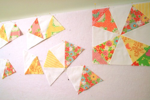
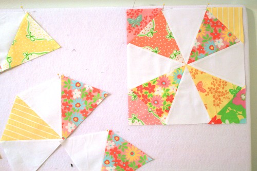
And after all that, I decided to go with this:

How predictable, right? In the end, my decision came down to contrast. These fabrics are all medium tones and adding a medium toned solid would hide the beautiful Kaleidoscope pattern. I rarely make fancy quilt blocks, ones that require super careful cutting and sewing on the bias. I feel that if I'm going to put all this work into a fancy quilt, I want the pattern to stand out.

Since I didn't want to use a dark solid, my only choice was to go light. And white is light and crisp and it's my favorite anyway.
Of course, while working with these prints, I came up with all sorts of ideas for more Dream On quilts. I'm pulling together all the solids I wanted to use but didn't...and maybe those will find a home in the next Dream On quilt. Until then, though...I have lots more Kaleidoscope blocks to make!

I wanted to focus on the orange prints. When I was little, my mom made orangey vintage sheet cushion covers for the loveseat in our backyard. They were huge and puffy and soft and cool in the shade. We spent many a summer afternoon nestled into those cushions, reading books and taking naps and looking up at the sun in the leaves. I even learned to embroider while sitting on those cushions. A quilt that felt like all that would be nice.
I thought about orange for my solid...and yellow and pink. I thought about excluding all the green and blue prints. I added back the green prints..but only the ones with orange in them. I really wanted to do something different, something fun.
And after all that, I decided to go with this:

How predictable, right? In the end, my decision came down to contrast. These fabrics are all medium tones and adding a medium toned solid would hide the beautiful Kaleidoscope pattern. I rarely make fancy quilt blocks, ones that require super careful cutting and sewing on the bias. I feel that if I'm going to put all this work into a fancy quilt, I want the pattern to stand out.

Since I didn't want to use a dark solid, my only choice was to go light. And white is light and crisp and it's my favorite anyway.
Of course, while working with these prints, I came up with all sorts of ideas for more Dream On quilts. I'm pulling together all the solids I wanted to use but didn't...and maybe those will find a home in the next Dream On quilt. Until then, though...I have lots more Kaleidoscope blocks to make!
