Bottled Rainbows: Teal
Today's Botted Rainbows block is Teal:
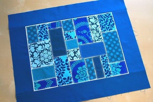
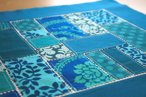
First, let me just say how hard it is to photograph blues. My camera turns all blues into pretty much this shade, when in reality, this block is more green-blue like the picture below. Second, I was worried I wouldn't have any fabrics in my stash to match this color (Kona Caribbean). And I didn't really...but I found some that worked alright.
I've been thinking a lot about color lately. If you couldn't tell, I'm pretty obsessed with things being matchy-matchy. To the point that things become pretty boring. I try to at least include different values (light to dark) but then sometimes a really light fabric ends up next to a really dark fabric and freaks me out.
I don't mind mixing colors together in a quilt. I'm a huge fan of "scrappy" quilts, actually. But if there are blues in the quilt, I want them to be similar blues. Or pinks or especially greens. Just so you know, trying to match greens is just about my worst nightmare. They're either too green, too blue, too yellow or too brown.
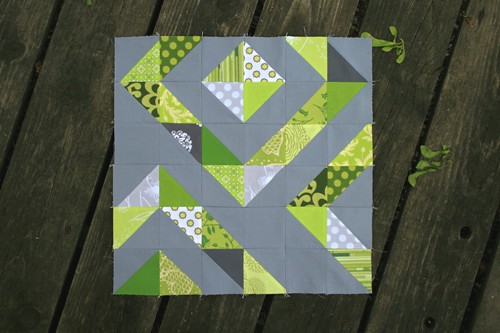
In fact, this is the closest I've come to "mixing all my greens" and you can see they're all pretty much in the "lime" family:
On the other hand, I really care about color. I think long and hard about it when picking just the right fabrics for a quilt. It's my favorite part! Perhaps the problem isn't that I'm too matchy-matchy...perhaps I just need more variety in my fabrics to keep things from getting boring. I'm probably always going to be particular about colors in a quilt...but more variety within those limitations sounds like it just might work. Next time I go fabric shopping, I'm buying lots of fat quarters!
So what about you? Are you an obsessive matchy-matcher? If not, do you just go with your gut or something? I don't get it!
First, let me just say how hard it is to photograph blues. My camera turns all blues into pretty much this shade, when in reality, this block is more green-blue like the picture below. Second, I was worried I wouldn't have any fabrics in my stash to match this color (Kona Caribbean). And I didn't really...but I found some that worked alright.
I've been thinking a lot about color lately. If you couldn't tell, I'm pretty obsessed with things being matchy-matchy. To the point that things become pretty boring. I try to at least include different values (light to dark) but then sometimes a really light fabric ends up next to a really dark fabric and freaks me out.
I don't mind mixing colors together in a quilt. I'm a huge fan of "scrappy" quilts, actually. But if there are blues in the quilt, I want them to be similar blues. Or pinks or especially greens. Just so you know, trying to match greens is just about my worst nightmare. They're either too green, too blue, too yellow or too brown.
In fact, this is the closest I've come to "mixing all my greens" and you can see they're all pretty much in the "lime" family:
On the other hand, I really care about color. I think long and hard about it when picking just the right fabrics for a quilt. It's my favorite part! Perhaps the problem isn't that I'm too matchy-matchy...perhaps I just need more variety in my fabrics to keep things from getting boring. I'm probably always going to be particular about colors in a quilt...but more variety within those limitations sounds like it just might work. Next time I go fabric shopping, I'm buying lots of fat quarters!
So what about you? Are you an obsessive matchy-matcher? If not, do you just go with your gut or something? I don't get it!
Comments
Post a Comment